Saturday, 27 December 2014

Photoshop Edits


Photoshop edits by Myself

   From the 12 photos I had taken for the xmas project, I decided to try manipulate them via Photoshop. I found this not only fun but interesting as I have never really worked with almost kaleidoscopic colours for a fashion project before. This is probably the main reason as to why I find the lights most interesting because they are the highlight of the photo, whereas the human figures are the outcasts and this can represent a strong message of many kinds. In addition, it also shows the movement in a still image by the shadows of how people are dancing and jumping around. I don't know whether there is a word or phrase you can say when you expect something to move when it doesn't, but I thought a series of these could tell a story by the movement of light. Plus, the movements within the image can also interpret the shape of style of the dress to make it look rather obscure, but it would make sense to the image. 


Photoshop edits by Myself

    These edits above I found rather interesting. Despite the fact that you can't see the human figures anymore, this makes this print look much more abstract and interesting, similar to perhaps even a human cell which could make up for the reduction of them. This could make my project have much more intense diversity within it by using flashing lights as a resemblance of human cells, thus we are created by light e.g The Sun, which again makes these images and edits have much more narrative to them. I really do like the ideas of relating light to life and how it resembles safety and renewal, hence this could really lead to something with more potential. I can't exactly think at the moment as to how I would make this differently due to my rather great start on working towards this. I must say however, it is really hard to push myself at home without having and sorts of machinery or stands to work on, so this must be something I have to do when I get back. I have many ideas such as knitting, the embroidery machine and perhaps even laser cutting to get this effect. 

Friday, 26 December 2014

12 Days of Christmas via Instagram: Night Lights


12 Days of Christmas

    Over the christmas holidays, we were given a short project in which we had to produce 12 images which had to be in the style of instagram. I particularly enjoyed this project because it allowed me to be very independent and flexible on what I wanted to show. Admittedly, it did say to incorporate some fashion items, however with my images, it is very hard to see people let alone to see what they're wearing. Despite this, I wanted to incorporate this with photoshop afterwards, but this would be for development work. I have already started some examples of this but for now, I want to keep very open minded with what I want to achieve at the end of this project.
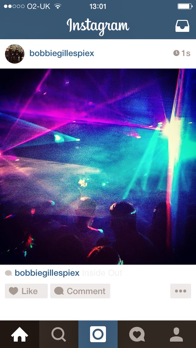
   Furthermore, I wanted to create something that I found quirky and fun and in this case, it was strobe/laser lights whilst I was clubbing. I wanted to make all of my 12 photos of my nights out because it shows how different they all are and how they make these fascinating bold shapes. Not only this, but I also liked how only the lights were mostly focused, whereas the people within the photo are blacked out. Hence, there are many concept ideas that I could use to take this forward, whether that being that it is the colour pallet of black and a bright neon colour, how people's memories are blurred and much more. Again as regards to being fashion items, I could interoperate these into prints or perhaps use photoshop to enhance the people within the photo and maybe even layer other images on top of them, whether that being a person or a physical piece of clothing. 

   In addition to this, I think that the lights really inspire me in regards to textures and surfaces, hence I see this as being a big starting point experimenting with new and unusual textures which I have never used before e.g bubble wrap, flexible plastics, cardboard, tin foil and much more. Learning from the previous project, I need to focus a lot more in regards to illustrations and time-management, so I will try to focus more upon these elements whilst still keeping experimentation and research in consideration. 

Monday, 15 December 2014

Final Collection/ Evaluation


    These are 5 of the prints I decided to choose for my final collection for the project of '3 Words'. I am very happy with what I have achieved over these past 2 weeks and I don't think I could have created anything better than what I have now with the same time frame because it would have been much more rushed and not as rustic in which I have drawn all the prints 100%, it is just the colourings which have been adjusted. I am most thrilled about the colour considering that I never thought me out of all people would be working with any shade of pink whatsoever, but it really does convey a message in my opinion and I feel that it represents all the 3 words I chose. Even more so, I can really see these being potential prints on top of garment pieces, whether that being on a top, dress or practically anything else. In addition, I really did want the print to be pretty minimalist, apart from the prints that have the heart pattern layers over them, but even then, they remain partially faded to show the background beneath it.    

    Furthermore, in regards to everyone else who chose Jack the Ripper, I felt that I probably had the most diverse and unusual outcome in comparison to everyone else who tended to make it very gruesome or particularly obvious to who they were focusing on. When it came to exhibition time, I also wanted to keep my layout very minimalist. Hence, I simply blue-tacked my A2 samples to the wall and then scattered my prints on top of the table to clearly show my developments. Although, saying this, i really enjoyed seeing everyones adaptations of all the words, regardless of it being Jack the Ripper or not, other people used the same words as me with another character and the majority managed to pull it off very well.

   Nonetheless, I got a lot of very positive feedback during the group crit, particularly from my Tutors who said that it looked very professional and finished to a high standard due to the amount of research and experimentation I carried out during the project. One thing that I can definitely say is that I was rather lacking in Fashion Illustrations, but as I've said in previous posts, I wanted to focus more on the experimentation and practical work rather than 2-D flat work which was what I tended more to do in previous projects. Despite this, I did do some illustrations for this project, but I just was under pressure from the lack of time to continuing to make more, but the inspiration and ideas were definitely there to carry out, hence I need to work on balancing my focuses and time-management so that I can produce more equally diverse concepts and developments.

   Overall, this project has taught me to be open minded, even if you don't really know what you're doing and in this case it was choosing your own words for your own outcome. This was a rather risky process as I could see some of the other students instantly regretted choosing the words that they did. Again in consideration to this project, I wanted to focus more upon the girls innocence with the murder's that Jack the Ripper committed during the 1880's. Hence, using cute, girly colours really expressed this in my opinion, but the original drawing/painting I created was much more violent and sharp making it way more obvious than my current outcome. I have definitely enhanced my photoshop skills more than ever and they have really paid off in regards to the group crit feedback and overall happiness of what I have achieved.


Sunday, 14 December 2014

Focused Prints

    I am thrilled by how many processes and experiments I have carried out for the past 2 weeks! Although, the drawing/painting I did below really is the star creation of this project and is the main initial focus for my outcome collection. With this piece, I then converted it into photoshop and began to mess around with it, wether that being the brightness, contrast, hue, threshold and much more. In addition, I also wanted to focus on my new colour pallet of hot pinks and pastel purples. I don't think there is actually much that I wanted to change about the creation I started off with because in my perspective, it really does elaborate on all 3 of my words. Moreover, the journey of my strokes within the piece is very jagged and bold, again relating more towards Jack the Ripper, but the red represents the word Bleed, whilst the jagged edges resemble the word Grotesque by elaborating on the dismantlement of the body, but within this drawing. 


Drawing/Painting by Myself

                                                   
Photoshop edit by Myself
   
    Above is the main base of all the prints I will produce for my aspiring collection towards the end of this project. I am really happy with the colour pallet as it is just what I wanted to achieve as it represents both the innocence yet bold violence of the strokes within the print. I also admire how minimalistic and simple it is, yet it stands out very clearly on screen and in my opinion, would look amazing on a small segment of a dress panel or perhaps a trousers leg. Honestly, I have no time to construct a garment in such a short time frame, although I am even happier that I got to experiment probably the most I ever had with all my projects, hence I feel like this is a much more finalised creation by myself, so when it comes to the exhibition, I will present a design board rather than a garment. 


Photoshop Prints created by Myself


    The edited prints I show above were produced using the first main concept for my collection, however because I spent quite a lot of time and detail on the heart, I thought that it might look rather good if I merge the 2 together. I made the heart into a pattern on photoshop, but it was just in rows, so I then edited the pattern to make it the heart print a half drop to make it look more interesting. Whilst doing this, I also played and experimented with the first main concept background by changing the brightness or contrasts for the print, which seemed to make them all look individual and unique as a collection to diversify them from each other. On top of this, I seemed to like the more faded heart pattern as oppose to the bright and obvious one, but this all depended on how dark I made the individual background and then the heart layers opacity of fading, but I am glad to say that I have exhausted this to a point of where I really do like my outcome ideas. If I could have changed anything, perhaps it would have been to use and mix up more of my drawings, although with my short time frame and adoration for my first drawing (the first picture on this post), it only made sense to use what I liked and try to make it even better. 


Concept Prints


Photoshop of Drawing, by Myself

   As I have said before in previous posts, I didn't want to purely focus on the heart drawing or the red slashed drawing with ink. Hence, I have branched out to experiment with my other prints before anything became finalised. From this photoshop above, I am rather keen on the lighter colours e.g. yellows and pinks. Moreover, I was pleased with what I had made, but it is too obvious for my liking relating with Jack the Ripper and also bleed. I have acknowledged a lot of people doing Jack the Ripper even more so than before, but this is due to a lot of people doing similar things, which I don't want to do. Hence, carrying out this potential print above would make my work look too obvious for my words and has no real original depth to it. Not to mention, the colourings within this photoshop edit still looks very blood-related, thus I wanted to have a concept colour pallet for my new work. 


   This print above was from the painted emotions I had whilst I watched the 'Human Centipede' movie, which is a stereotypical, grotesque horror film. Although, as oppose to the previous photoshop edit colourings, I decided to focus more on the light, pastel colours to reflect the innocence of the victims during the murders, yet conveying that their jobs were not innocent in the sense that they slept with random men to survive, which was never their intentional choice of a life career. The photoshop edit of my painting looks very much like the abstract painter, Wassily Kandinsky's work. Throughout this project, I have really wanted to keep in great contact with fine art for this project, to reflect my own ideas instead of using someone else's concepts and creations.

    Below is a print I constructed via photoshop using another drawing which I did, but the main key focus that I love about this print is the colourings. It fluctuates from a fuchsia pink to a pastel purple, which correlates to my narrative of the innocence of the murder victims. In fact, I'm not that bothered about how this print could be different because I am focusing more on the colour scheme as oppose to the actual designed print itself. Moreover, I wasn't too keen on the drawing anyway, although it does look rather more like a collection print for fabric or perhaps even a wallpaper by its subtle tones of colour with the pastel background also. It could also convey another message in which this print could represent all the women and men killed by other people for pleasure by manipulating the body or deconstructing it in some way, which is why I decided to watch the 'Human Centipede' because the villain in this film finds that surgically joining humans pleases him, which is similar to Jack the Ripper technically.


    Overall, the main outcomes of these tester prints is that I have now finally managed a proper colour scheme for my collection prints, which I can then choose to make into a garment or not. However, when it comes to presentation, I will probably just have my fabric samples out to show my tutors and class. This project has really helped me establish myself as my own person, coming to narrowing conclusions as to what I like and dislike. Although saying this, I have stepped out of my comfort zone for this project because I wanted to push myself into the unknown and unexpected to really make my portfolio diverse and unique, instead of a dull, constant style. Don't get me wrong, having a persistent style clearly shows off the individual, but if you apply for any type of job, it is very unlikely you will get to pursue your style again till you really make yourself known in the work place to show that you have potential of creating new ideas, which is why I am making this more business related than personal. Despite this, I have made it personal in subtle ways in which I have used my fine art experiences to incorporate into my prints and developments for this project.

Saturday, 13 December 2014

Mannequin Structures

Earlier drawn creation by Myself @ start of project 

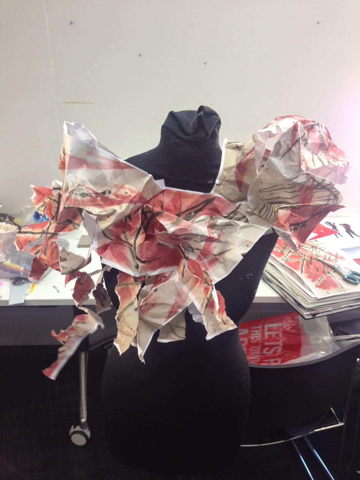
    Ever since I completed this drawn/painted piece, I was instantly fascinated by how unusual it looked as oppose to what I usually tend to do. I thought that this piece in particular related to all 3 words, being Jack the Ripper, Bleed and Grotesque. Moreover, I decided that I needed to do more 3-D stand work rather than fashion illustrations. Not only this, but I also get to use my creation as a substitute print on the mannequin making it look more detailed and shaped. Throughout the afternoon, I managed to create a substantial amount of concepts through this print. If I could have done anything differently, it would have been to experiment more with scale and colour, perhaps even creating a potential colour scheme. Not only this, but it would have been good if I did a few drawings using different mediums and textures whilst creating these stand silhouettes. 


Mannequin Structures created by Myself

    I am very happy with the way these structures turned out in a sense of their unique approach and diversity to juxtapose each other to represent something different. I made this similar to when we began working on the stands at the beginning of the project, by correlating the shapes with our words and the fact that I now have a hand-made print to work with, it magnifies the words even more. As I said above, I would have liked to have more of a range of colourings and scale, but perhaps some of the other drawings that I previously did could have taken part in this 3-D process to enrich my work. 

   Overall, I think that I will definitely take this 3-D work into consideration when I come to do my fashion illustrations as it has helped me to become open-minded, but also more persistent on a generalised final outcome idea. Considering I don't have much time left for this project, it will most likely be the last stand work I do for this piece, hence I want to take advantage of this work that I have done so far, to elaborate more on moving forward from which I have already created. 


Fine Art of Hearts

   Following my previous work up until this point, I have come to a conclusion that I want to focus more of my project upon a more fine art based final outcome. Hence, I decided that I wanted to draw a body part that relates to all 3 words, yet have a more sentimental meaning to it. This led to the decision of drawing a heart; I wanted to draw a heart because Jack the Ripper's victims were predominately prostitutes, which their main job was to 'make love', thus it is rather ironic and less grotesque than it appears. More so, the heart is the strongest organ in the body which pumps blood all through our bodies to keep us alive, so again it is more ironic in the sense that Jack the Ripper killed these victims to dissemble their body parts, yet it was something he enjoyed doing.

   On top of this, I have really enjoyed working with photoshop in the past which means by this stage, I should be much more aware of even greater potentials and outcomes for my work. I am progressively thinking more forward when it comes to my outcome, which I now believe will be a collection of prints that go on parts of a garment or perhaps the whole thing. In addition, I have never had an outcome like this before, so it will be interesting to have more of a designers approach when it comes to prints and fabrication to go onto a garment.

Drawing of a Heart, by Myself


Photoshop of drawn Heart, by Myself

   One thing in particular that I appreciate and pride myself with by doing this process is that it is completely primary from how I have drawn it and then converted it into photoshop. I plan on doing a lot more experimentation with these hearts, but these are just the basic steps I began with. If I could have done anything differently, it would have been to spend more time on drawing the heart or perhaps even draw another body part alongside the drawing I already created. Overall, I am generally happy with what I have produced so far and I can see my path getting narrower at every stage coming closer to producing my final outcome, however I now need to have a definitive narrative to my theme so that I can elaborate and focus more on that, hence I will get a much more intricate and enriched final project piece, whether that being a garment or fabric collection. 

Friday, 12 December 2014

Fashion Illustrations

   With inspiration from my acrylic painted fashion illustrations, I decided to cut out the photographs of the stand work I did previously and then splatted ink over the new illustration. I thought this was a good process in developing my theme without making it completely obvious and in this case this work focused more on the word, 'bleed'. Carrying out this process not only helped me to develop my illustration skills further but also enabled me to do this using different mediums, e.g ink and cut out primary photographs to enrich my work. I have really enjoyed carrying out this project of 'Three Words' as we can all see every students individual approach to this project. However, I think at this stage of our foundation course, you can definitely tell who is coming out the strongest within this course and it all relies upon the individual as to how much they will push themselves during foundation and that is what I am trying to push myself to do. Hence, with this project as I've said before, I want to experiment as much as possible to experiment with various processes and outcomes. For the next project, I plan to focus more upon the fabrics and textures, whereas for this collection, I will focus more upon the details of my fine art approach and see whether I will have time or not to create a garment.


Fashion Illustrations by Myself

    Nonetheless, if I could have done something to improve, it would have been to have composed more stand work photographs or perhaps had used the drawings I created instead of the photographs to add a more personal and hand-made approach to these illustrations to show that they're 100% drawn by myself. On top of this, I could have also scanned and photocopied the mannequin photographs before I added them to the illustrations to add more depth and narrative. Although, considering this is just experimentation, I felt that it was enough of a successful process but I don't want to carry it out any further, but it may be taken into consideration for other projects apart from this one. Overall, the next steps for me would be to construct more shapes and manipulations on the stands and see where I go from there, alongside even more fashion illustrations to draw more final concepts to create more of a sense of a collection for this project.  

Wednesday, 10 December 2014

Painted Journey of Vision

    I decided that it would be an original, yet quirky way to adapt to a new process where I would watch a scary film and see how my brush strokes would resemble my mood or emotions. I did this using acrylic paint on cartridge paper, whilst watching the 'Human Centipede' which is a well known Horror genre film. The concept of the film is a man who wants to attach multiple bodies together and I thought that it could relate to Jack the Ripper slightly in which he mutilated many women for fun and pleasure. Hence, whilst I was watching scenes within the movie, you could really tell which bits made me more abrupt or slow in anticipation for what was to come.


Painted emotions/fear

    With these paintings, I thought that it would be good to convert these into fashion illustrations to resemble a primary print. I also tried not to cut into the paintings as much so that the strokes could make the 2-D garment much more flamboyant and unique to express the emotions I went through to create the print. To make the process faster, I decided to photocopy a model image I found in a magazine so that I could focus more on what the garment would look like in many perspectives, rather than spending my time drawing different models. Not only this, but I also wanted to see what it would look like in black and white. This is due to the fact that I don't want my works to be completely obvious, in that case it would be working with liquids or the colour red. In addition to this, I would have liked to have created more paintings whilst watching other films or perhaps even sounds that people find terrifying e.g scraping metal, chalk on a black board, grinding teeth and many more which put people on the edge. 


Concept designs made from paintings

   Overall, I think that this process worked well in the sense of that it looks a lot more like a collection rather than 1 exaggerated garment. Thus, it is making me think as to whether I should design fabrics for possible garments or stick to focusing on one bold garment. It is a shame that the project is only 2 weeks but hopefully I can see if I can formulate something over the christmas holidays, depending on the final outcome of this project. 

Tuesday, 9 December 2014

Development on the Mannequin

    As a designer, it is crucial to exhaust all experimentation whether that being 2-D or 3-D. I got to use a diverse range in fabric from mesh to calico which enabled me to play with different shapes and textures, even combining the both added a nice texture to the mannequin. I wanted to incorporate the journey of my drawings and how they represent slashes and staining, hence I cut, shred and scrunched the fabric to get these textures. Moreover, I also had to relate these to my 3 words, Jack the Ripper, Bleed and Grotesque, thus my manipulation the fabric encouraged me to represent falling body parts of sections of the anatomy to mould the words and theme together, hence I could already get a sense that all my ideas were coming together and that the next step would be to start doing some illustrations. In addition to this, I sketched my mannequin work whilst it was on the stand to get a more realistic and 360 degree perspective of the shape, rather than drawing from a photograph which isn't in proportion and false in lighting. During the day, I managed to finish around 7/8 of these stand works, whilst doing other developments also. However, I would have liked to of created more, perhaps on a bigger scale also, but we were only allowed 15 minutes to not only construct, but draw the mannequin also, thus it was a very short time period to complete the task.


Development of shape on the mannequins, w. primary photographs and line drawings


      Overall, I felt happier that I had completed this process as I would have had to of done it at some
point during the project. I was particularly pleased how I managed to convey my 3 words across by using shape and manipulation on the stand. I have now gathered enough inspiration to start working on my illustrations, developing these processes further and coming to a more drawn conclusion of what I want for a final outcome. Our tutors keep telling us that this is a fun project, hence I want to try experiment with lots of different mediums to see what works and what doesn't, which will help me take consideration for what to do in future projects. I will definitely put these shapes and manipulations I have made into more consideration when it comes to illustrations, however I think that it will really help process my ideas further. Although, considering I don't have long left, I will continue to experiment with different processes whilst I can before the christmas break.