Monday, 29 September 2014

Accessories Workshop: Day 1

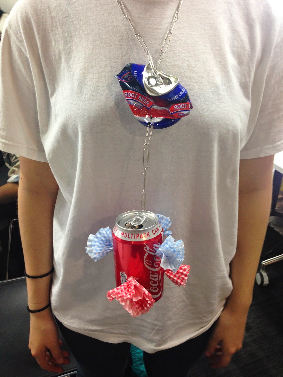
    I had very mixed emotions towards this weeks workshop, however as a designer, I felt that I was a lot more confident in what I produced using a range of different materials and medias. My favourite piece I created was a neck piece with 2 cans, plus I thought it related really well to my idea of animal cruelty as a theme with the paperclips resembling chains etc. In addition, it was a great experience to push my boundaries and create something which I've never done before (well not to this extent) and I found it very unique and enjoyable. If I could have changed anything, it would have been to use a wider range of materials or create something more elaborate, but these had to be fairly simple samples so that we could complete the next task which was to photocopy the accessories and create a page in our sketchbook exhausting the copies to create something new.  I found today a real challenge for myself as I wanted to stand out from the rest, yet at the same time still relate to what I wanted to achieve as a final piece. Below are some examples of what I created:


     Overall, I think this day has been very successful as a first try and I am excited to see what we have in store on Wednesday. It would be very interesting to see whether I may create an accessory piece alongside my garment to make it more elaborate and detailed. 


Sunday, 28 September 2014

Idea Developments: Animal Cruelty

    Today I had a massive lightbulb moment when it came to deciding what I wanted to do for my theme, which relates to both structure and attachment. I think this idea is truly remarkable and will portray a powerful message which is, Animal Cruelty. I really did like the idea of working with furs and textures, however I could do this by representing an animal in chains or in distress, whether that being wounds, cuts or more. Hence, it relates to structure in a sense that it is animal slavery and has been used for thousands of years, moreover it relates to attachment because it has happened to us humans also and we also consider the majority of these animals to be peaceful and in the wild, some even being household pets, which is very devastating. In addition, I think carrying out a theme like this defiantly gives me an incentive to push my creativity forward and get my point across that it is extremely brutal and needs to be stopped as soon as possible. Not one single organism in this whole universe deserves to be treated like this, especially those who can't even speak for themselves and it is something everyone should stand up to. The pictures I show below are probably the most moderate i've seen as I don't want to put a horrifying picture into your head, nevertheless these are upsetting enough and I think it relates very well to 'Structural Attachment in Mono'.


    Plus, there is a lot of irony to this project as I will be using FAUX materials and fabrics, rather than real ones which were most likely bought illegally and hurt the animals tremendously to get it. Thus, I would like to encourage and promote faux fur (fake) rather than the real material because it saves millions of lives and prevents a large amount of animal cruelty. Peta.org quotes,
         "More than half the fur in the U.S. comes from China, where millions of dogs and cats are bludgeoned, hanged, bled to death, and often skinned alive for their fur. Before they are skinned alive, animals are pulled from their cages and thrown to the ground; workers bludgeon them with metal rods or slam them on hard surfaces, causing broken bones and convulsions but not always immediate death. Animals watch helplessly as workers make their way down the row."
It is truly heartbreaking to believe that this still happens in present day, but I feel that my project has more emotional depth as I am a true animal lover and I would like to completely destroy the hierarchy of illegal poachers and skinners who work in this dreadful trade. 

Saturday, 27 September 2014

Gathering Ideas for 'Structural Attachment in Mono'

     Yesterday, I had my very first tutorial with Becca, which I think went rather well and I also had a lot of feedback and advice about my work to enhance my overall grade. I am very certain on doing a red/orange colour pallet to be suitable for an A/W Collection, however when I was with Becca, it came down to the discussion of my ideas for this project and I really liked the general theme of 'textures', although I had to figure out how to relate it to both words 'structure' and 'attachment'. Below is a list i've produced for each words and how I think it relates to my project.

STRUCTURE W. TEXTURES:

- Shape, Scale, Material, Engineering, Installation, Support,
Thickness, Density, Flexibility, Hanging, Insertions, Padding, Layering, Hems,
Stitching, Buildings, Landscapes, Artists, Designers


ATTACHMENT W. TEXTURES:

- Attachment to fabric, Time Era, Religious symbols, Relationship memoirs, 
Objects (accessories), Print, Colour, Society, Trends, Family, Designers, Everyday life, 
Photographs, Technology, Emotions

     It is a lot harder to summarise ideas for attachment with textures due to it having to have more or a sentimental meaning towards the theme, although from what I have come up with, I can see it developing further along and starting to come together. Whereas the structure side to this project is much easier to have ideas for because there are more practical things in which I could relate textures to. Furthermore, I will have to go through this in more detail and have a good think about the main initial idea for this project so that I can move forward and begin to start my real development work for my own pieces.

Friday, 26 September 2014

Knitwear: Final Day

   Overall, the whole week of producing knitwear is something I will not forget. At the start, I was very conscious of what I was doing, which took up a lot of time, but by the time I got used to the techniques, I was much quicker with my swatches and began to enjoy what I was creating. On our last day, we had to create 2x A4 size swatches of knitwear, which we then presented to the class at the end of the day. Luckily enough, one of my designs was chosen as a favourite by Bid himself! Thus, I have a sense of achievement for this week. I really liked working with knitwear and I intend to try it once again another time throughout the year considering I still have all this fresh knowledge in my head and there are many ways I could incorporate it with my current theme. The swatch I was chosen favourite for included techniques such as honeycomb, lace holes, weaving, fraying, hemming and more, although we were only supposed to have around 5 techniques in each swatch, but it was so hard to resist! I liked the way mine looked in the sense that it can portray emotion, whether that being anger or sadness because it starts off neat and ends up in chaos.


   In the end, I was really impressed with everyones designs and I loved how diverse everyones was, whether that being colour, style, technique pattern and so much more. Plus, Bid was very nice to work with as he has great knowledge and knows how to explain the processes very well, which is why everyone did really good this week. If I could change anything, it would have been the colour pallet although we were working in pairs so we had to make alternatives and agreements considering we couldn't keep switching colours with everyone. Moreover, I still would have liked to have learnt more techniques with this workshop, but I feel comfortable enough to say that I have learnt a great amount nonetheless and it is an incentive for me to try this process again in future. 


Thursday, 25 September 2014

Textures

   Today I decided to create some illustrations with inspiration from research I found in the Ravensbourne Library. The images I found were in a Japanese book called BoroBoro, which as a whole represents clothing which would have been worn by Japanese peasants who couldn't afford lavish silks and such. I found an extract on the history of 'Boro' from a web page called, http://furugistarjapan.wordpress.com, they stated:

      "Boro is the clothing that was worn by peasants, merchants or artisans in Japan from Edo up to early Showa (17th – early 19th century). In feudal times, the majority were peasant farmers… Literally translated as rags or scraps of cloth, the term boor is also used to describe clothes and household items which have been patched-up and repaired many times. Once clothing was made, it would be maintained throughout the owner’s lifetime, or perhaps even longer."

     Moreover, when I was glancing through the book, it was clear that the traditional meaning now made sense, as the fabric itself wasn't extravagant to start off with, but they managed to manipulate and shape the fabric to make it look a lot more impressive and unique. A lot of the textile designs in the book were minimalist and simplistic, although the made a great affect by carrying it throughout the swatch, giving it real depth and texture. Hence, when I found these designs, I wanted to become inspired and see what they would look like on a mannequin or illustration, so I cut out garments from the photocopies and I think they worked very well. Not to mention, they relate to the theme of 'Structural Attachment in Mono' very well in the sense it has its historically cultural background and the structures and forms they create with the fabrics. 


    I am really happy with the results of these illustrations and it is such a nice feeling to start producing my own research now, but it is still very useful to document our workshops as well because they influence to push us further along the course by learning new things and this work of mine has defiantly been inspired by myself and perhaps the digital print workshop because the 'BoroBoro' book included secondary photographs, which I then photocopied and cut up to create these designs. If I could have done anything different, it would have been to perhaps create even more designs or use more photocopied prints, however the book itself did not contain many pictures, the majority was writing about the fabrics themselves and how they were produced. Nonetheless, there are many books similar to these and it won't be hard for myself to get even more ideas for creations. I also really liked doing this because I am trying to focus upon the aspect of textures. Recently, I have been evolving around fur and knitwear (current workshop), however these illustrations include frayings, lace, sublimation prints and more! Thus, I am really trying to dig deeper within this project so that I can get a very strong and supportive final piece to relate to this project. 

Wednesday, 24 September 2014

Knitwear: Day 2

    Knitting was really not my ideal choice of practice, although doing samples and swatches now using a machine has completely changed my mind. I am really enjoying this workshop and it is apparent that it is not everyones thing, which I thought I would be categorised into. Nonetheless, we learnt all new techniques today such as volcano, bubble, stripes, orange peel, hems and fringing. My favourite technique today was the volcano. I really like how it added structure and depth to the knitwear, hence giving it texture and a more interesting approach. In all honesty, when the other group began with the knitwear workshop, it looked a lot more complex than how it seemed and now I have come to grips with it more, it is much easier to get the hang of and much easier to experiment with, which is why I'm looking forward to friday when we have to create 2 A4 knits consisting with 5 different techniques per swatch. Below are some examples I created today,


    I think that this day was a lot better than Monday considering I understand the machine better and I know how to work it properly now. Plus, it is more fun when you know how to manipulate or change the perspective of the sample to make it more unique and interesting to the eye. This workshop has been incredibly helpful towards this project in the sense that we have used a new material and media, which I have never done before. Also, we learnt how to create a structural pattern on the knit, whether that being the bubble or volcano to give the knit shape. On top of this, it also relates to attachment because we learnt how to add separate parts together e.g fringing, thus it relates very well to our project so far and may become useful towards the end of the project if I decide to use this process. Bid told us that the 'orange peel' technique is commonly used for scarfs to create a more 3-D affect, but he said we would go into more depth with that on friday, thus I am really excited and sad about our last day producing knitwear samples! If I could have changed anything we did today, it would most defiantly be the colour, but we weren't able to choose our colours. Regardless, they work the same and I was able to learn things I never thought I would have till at least BA and for that I'm very grateful that we did! 


Tuesday, 23 September 2014

The EY Exhibition: Late Turner – Painting Set Free

     As a little day trip, I had decided to go to Tate Britain this morning to visit 'The EY Exhibition: Late Turner' to have an open mind to gather even more inspiration to produce more ideas for this project of 'Structural Attachment in Mono'. I think that this was a very useful experience for me, despite the exhibition being made out of paintings, I could see the overall structure of the paintings landscapes and also how people may become attached to them, whether it was their hometown, a dream location or a sense of feeling towards the pieces. Plus, I love the way his brush strokes and washes make the paintings look as if they're a blurred memory of a certain location, telling us in future generations that this place will never look the same and now it will always be a distant memory to how things used to look. Moreover, I wasn't able to take any photographs, but I managed to get some from www.Tate.org.uk as a secondary resource. Tate quotes,

       "First exhibition devoted to the extraordinary work J.M.W. Turner created between 1835 and his death in 1851. Bringing together spectacular works from the UK and abroad, this exhibition celebrates Turner’s astonishing creative flowering in these later years when he produced many of his finest pictures but was also controversial and unjustly misunderstood It is a panoramic survey of a bountiful and significant period of exceptional energy and vigour, maintained despite failing health."


    When it comes to painting, I have never been a truly devoted and enthusiastic artist to recreate something like this, but from all the variety of colours and the way J.M.W Turner creates his brush strokes relates very closely to the fall of a garment and it would even look very nice as a digital print on a garment. In addition, this is very similar to what Lisa Perry did for her 2015 S/S NYC Fashion Week collection, from when she had an artists work in the background to reflect her and her inspiration for her garments. Thus, indeed it shows that you can get inspiration from practically anywhere. Another thing I particularly liked about this exhibition was that it contained different elements of culture, generations, non-industrial, rural land and more, which gave a sense of history to his paintings and reflected his life to understand where and what time period he got his inspiration from. If I could do anything with this print, I would make it either a digital or sublimation print on a white piece of fabric, which could be used for either a skirt or top and it wouldn't have to be terribly precise because Turner uses a very fine wash of watercolour, hence it wouldn't be as noticeable. Moreover, I really like his choice of colour pallets, which tend to be more of a pastel tone and they usually follow through the entire painting, rather than something for example, Picasso with his abstract bold shapes to create a figure or object. Overall, this was a really interesting trip for me and I would like to see perhaps within the next week whether I could do something to this to create a sample or twirl from this inspiration or maybe even use these paintings as a start to something of my own creation. 


Monday, 22 September 2014

Knitwear: Day 1

    I have been really looking forward to this workshop for a while now and today has proven to fulfil my hopes for this topic. In the morning we began by learning all the health and safety rules and then the general set up process for the knit machine, which seemed complicated at first but was very easy once we all got the hang of it! We also spent the day taking notes from what Bid said for future reference and it may come to use some time. These notes consisted of things such as, 1) KNIT: Always start at 0, *Carriage= Machine swiper, *Tension Knob= tight/loose knit, A= Out of action, B/C/D= Knit. These notes may sound complicated, but they all make sense now that I am aware of the machine and its capabilities. Moreover, we learnt many techniques such as a standard knit, honeycomb, lace, ladders and more. In particular, I really liked the ladders because it made the acrylic yarn look a lot more interesting with textures and shape, along with the honeycomb, which is a theme topic I am aspiring to follow on to. Below are some samples I made,


     Overall, today was a very productive day in my opinion and personally I think I enjoy this a lot more compared to digital print so far because I like the rusticity of the knit samples and it also allows us to do whatever we want in our own way, as long as it still follows Bid's rules/examples. If I could change anything, it would defiantly be colour, but we didn't get to choose unfortunately, plus I would have liked to had experimented with newer techniques, although there were some people in the group who found it a bit more of a struggle, however I guess you can't like everything! 


Sunday, 21 September 2014

Fur-Inspired Fashion Illustrations

   Whilst being at home over the weekend, I decided to create my own illustrations which purely involved fur. I have been inspired by many designers, for example J. Mendel and Marni from my blog posts. Nonetheless, I think that it is a brilliant texture to work with and adds a lot more structure to the body. I did this task using charcoal because it has a true depth to it and I also like the rusticity it adds to the illustrations, making them look a little bit more hand-made, rather than extremely precise, which can make the designs look a bit dull in some cases. On top of this, I am more than sure that my final piece will involve fur because it relates well to both structure and attachment. I really enjoy doing illustrations because it adds a bit of life to the drawings, rather than a 2-D structure showing all the seams and such. Plus, it really does reflect on how you are as a designer, whether that being the body shape, facial features or perhaps even a certain style of a repeated collection. As you can see, all the models have the face covered with lace, to add to the black elegant and mysterious look, because it makes it all tie together to create a certain look and in this case, mine is mystery, texture and elegance.


    If I could do anything alongside these drawings, I would add colour or perhaps use other textures such as pleats, tucks, folds and more. Not to mention, I could also use other fabrics like leather, organza, lace etc.. Despite this, this research and development work relates well to this project and I am excited to see where it will take me in the next few weeks because I want to create something big and bold for my piece and to stand out as much as the garment piece/s can. 

Saturday, 20 September 2014

Marni A/W 2013/14 Ready-to-Wear

    Yet again, I manage to stumble across designer, Marni. I truly think that her work is remarkable and the catwalk I discovered was from Milan Fashion Week back in 2013. Nonetheless, this collection screams elegance and texture, which is going down similar roots as to what I want to do for this project because I think it relates well to both 'structure' and 'attachment'. Vogue quotes,
       "A minimalist and fashion-forward take on Where The Wild Things Are, this was another of Milan's fur-filled shows"It's austere but with a romanticism, it's melancholic, severe," described Consuelo Castiglioni after the show"" 


      The two examples above are absolutely flawless in my eyes, I love how the fabric drapes across the models body giving the garment length and yet again, elegance but still in a more male approach with the style and shape of the garment pieces. Moreover, the colours are obviously mono and work really well with our current theme and I think it makes the collection stand out to a great extent. I really do like the idea of working with fur, in which I got inspiration from J. Mendel from his most recent collection at New York Fashion Week S/S 2015. On top of this, there are many varieties of textures which I could include in my project, not just fur. Although, I haven't had any proper experience with it so I would like to sample some swatches so that I could get more of an idea on how to use it and how it can manipulate on a sowing machine. Overall, I have defiantly swerved towards the elements of textures for this theme and I think my interest will develop even further after I complete next weeks workshop creating knitwear samples.


Friday, 19 September 2014

Digital Printing: Final Day

    This was the last day to the end of our week of doing digital printing. As an overall experience, I really enjoyed this workshop, however I would have liked to have sampled with fabric rather than paper, although we apparently have that in a future workshop, so it isn't anything to worry about. Nonetheless, I think I have achieved some really successful prints over this past week and our project for today was to do a group collaboration garment on a mannequin using 2 of our prints each. I really enjoyed working with my group, although I think I had a bit more of an influence on the design idea itself. We also decided as a group to make the main focus colour blue as one of the girls prints was practically impossible or very difficult to change into a new colour. Despite this, it came out really well and had a natural aquatic feel to it. Plus, the arrangements of the paper prints was done very effectively and related to the project very well.


    This development work really made me understand how important many fields and medias are with fashion, whether you are using the techniques or not, but it is always an exceptional skill to know and get the grasp of because it can save a lot of time and look more precise. Moreover, I really liked our garment structure we made today, although I would to classify ours as 2nd best because one in particular really raised the bar and had an element of Vivienne Westwood to it because their prints were a slyly tartan camo style with an elegant structure. In addition, I am looking extremely forward to doing knitwear as I have never done it before, plus the samples I have seen from the other group look amazing and complex, however easy they say it was to do. Thus, this will be what my blog will entail all of next week and I hope to create very interesting and unique swatches and samples. 


Thursday, 18 September 2014

Marni Evening Resort 2015 @ London Fashion Week


       "Launched in 1994, Marni is a luxury brand favored by a discerning coterie of international women who are curious and sophisticated: not necessarily fashion-driven, but with a strong identity and a personal vision. The Marni woman is hard to pinpoint. Elusive and arty, she likes to play with forms, prints, textures and colours."
                                                                                                                   www.Marni.com

     Today I have decided to look up on the latest designers at this years London Fashion Week. The one in particular who caught my eye was Marni, due to her insight into a mono theme (like ours) and also the textures she's uses with her collection, such as fur, wool, silk and more, thus giving it an elegant approach. It is agreeable to say that she is most defiantly a luxury brand and successfully manages to take tradition women's evening wear and juxtaposed it with inspiration from men's wear. Plus, she adds the feminine touch by using the garments with accessories such as embellishments and fur wraps. I really liked this collection because it really relates to what I am thinking of using as inspiration for my project, which is textures and I can use this for both words 'Structure' and 'Attachment' in the sense that its structural due to the texture and shape of the garment, but is also attachment due to the nature element of fur and from which it came, not to mention a slight feeling of security from a box shape, which may be why it has a male flair to the collection. Below are some examples which I found and thought represented the catwalk collection very well. 


    These garment pieces above are absolutely amazing and I really love the tailored look to them, again relating back to the male approach. However, the embellishments and accessories that go with the pieces really make a statement, in which it shows how women are taking over the working world in style. One of the things I like most about this collection is that the garments are timeless, in the sense that males have worn suits for decades and has never seemed to go out of trend when it comes to work wear, moreover I also find it amazing how Marni manages to mix garments from old seasons and making them into something which looks completely new and unique, but this is what is needed for a very creative designer who also works with new up and coming artists alongside her. Her work relates well to my previous research about J.Mendel who also works with textures and I already have a gut feeling that I will be working with something rather similar. 


     I find Marni to be very inspirational to me with her new S/S 2015 collection and I can really see myself doing something rather similar to her because it is comfort-fit chic for the new working world, thus again it can relate to structure for the hierarchy of women moving up in businesses and attachment from they way they're moving up together in a strong and independent way. 

Wednesday, 17 September 2014

Digital Printing: Photoshop (Day 2)

     Seeing as we had yesterday off, the work I produced then came to great help today. This was due to using the photoshop creations I made yesterday and used them further for some of todays designs. Nonetheless, I also produced more designs from my own photos which I already had on my mac. I preferred this day to monday because I felt that we were really digging deeper with this topic and developing work relating more to our theme. We began the day by using an image of a cloud and using it to create an all round edged photo which we could repeat without seeing the trap lines. This was rather difficult as we had to clone the clouds and move them around to be more realistic, however it was a really useful thing to know in future because Dan said he did the same process for Vivienne Westwood. Below are some examples,


     Once we completed this task, we got to be a bit more independent with our designs and I decided to use different aspects, although it became increasingly difficult to decide on a 'mono' colour as there were different tones and shades within the design. If I could have done anything more, it would have been to elaborate shapes more perhaps to give it a geometric flair, although I am still happy with my designs and perhaps it may be better without them, but it would have been good to experiment more. Below are my own designs from primary source images,


    I have really enjoyed todays workshop and it defiantly helped me to progress further with not only my skills, but my developmental ideas towards the end of this project and I would highly consider doing something which involves digital print because it adds so much more detail and precision to the garment itself and you would have no worry in regards to the limitation to the amount you have, hence this media process has been very exciting and extremely helpful for future photoshop use.  

Tuesday, 16 September 2014

Photoshop developments (My day at home)

     I am fond of the days when we don't have to come into Ravensbourne, not because I want to be lazy and watch tv (despite my love for a good cuppa!), but because I really enjoy working independently at home when I know what materials I have and I don't have any time limits to my day, thus I can work at my own pace and stop when I am happy. Today I decided to elaborate more on my photoshop skills so that I will be more advanced for tomorrows workshop day. Instead of exhausting secondary images, I decided to use a few of my own. One picture I did relates to the word 'Attachment' because it was a very special holiday in Wales for me and the scenery was absolutely beautiful by the beach with caves and vast amounts of yellow sand. On the other hand, I also did a photoshop creation with the word 'structure' by using a skeleton I took a photo of whilst I was in the Natural History museum not so long ago. I have also tried to stick with the 'Mono' look, however considering this is still research development, I really want to keep my options more open with what I am trying to achieve by the end of this project. If I could have changed anything, it would have been to change the repeat heights and widths, however it took me quite a while to figure out how to do, so clearly I do need more help from Dan tomorrow to make me even more advanced and understanding when using photoshop. Below are the examples:


     This creation above was the one which related to 'structure' because it shows the anatomy of a human being. However, to create this, I used the magic wand to trace over the main structure of the skeleton, although it didn't work properly. Despite this, I like the look it gave off without having a head because it becomes a sort of mystery in a sense. Whereas, the creation below shows a primary source photo I took of a cave whilst on a beach in Wales, which I then layered vertically to create an elongated effect. Then, I used the brush tool over it and then put on a threshold effect as a layer, which makes it look a lot like a print or stamp and I also experimented to see what it would look like in different colours, however this is the original. I am very excited to see what I will produce in the end because I really like using the concept of digital design and printing, which makes the garment look a lot more detailed and interesting to a great extent, it also adds more perspective to the design because it isn't always clear as to what it is unless you take a closer look or let your imagination take over. 


Monday, 15 September 2014

Digital Printing: Photoshop

     This week, my group has been assigned to carry out a mini digital print workshop using all different methods and techniques. Today however, we mostly focused on the basics of photoshop and how we could use them to manipulate or enhance an image, whether that be cropping, colour changes, scale and more! Personally, I really like working with prints digitally and I have always been inspired by designers, Timorous Beasties and Mary Katranzu. Despite this, I still really like the rusticity of doing the prints by hand, but it is very useful to have the knowledge of digital printing incase I don't have as much time or if the print needs to be very precise. Moreover, I have previously had experience working with photoshop with some of my previous projects in 6th form and really took a shine to them, but it always seems as if you forget the basics very quickly, hence I took a lot of notes from Dan today! Below are some examples of which I created myself.


      Above are some of the works I did today. In particular these flowers were downloaded from a file Dan showed us and we learned many quick and easy ways to crop or select a part of an image without taking too long or trying to be too neat with it, which I never knew before. (I always had to do it the hard way!!) Nonetheless, I played around with the pattern styles and colourisation and really liked the effects they gave off because they make it look a lot more interesting and as a print, I think it works pretty well. If I could change anything, I would have liked to have done something a bit more advanced, however I think the pace we were going at helped me to pick up on more things, rather than rushing and not understanding properly. Also, I can really see how this process of digital printing is going to be heavily involved in future garments and trends because the possibilities are endless and it is much easier to get the print to an impeccable standard. 

   
    Last but not least, we also learned how to carry out a repeat pattern process which works very effectively as a design because it can be used for a lot of fabric, which could be put on a whole garment, rather than just a segment. On top of this, I learnt how to be very specific with my layering processes, which then helped me to carry out other processes, such as colour blocking, changing shapes, rotation, drawing and much more. So overall, I thought today was very productive and I can't wait to see the final result for everyones prints. 

Sunday, 14 September 2014

Collection Buying Exercise Homework ft J. Mendel NYFW

   Over the weekend, I decided to complete my homework task, which was to find a collection that interested me at NYFW and I chose J. Mendel. From there, we had to create a list of the reasons as to why we would buy these and I did as follows:

1) Textures
2) Digital/Graphic Prints
3) Bold Colour Variety
4) Fitted style
5) Pattern choice
6) Fur
7) Co-ords
8) Fresh Look
9) Early 80's Style
10) 2-Tone Majority

   I really liked J. Mendel's collection for his new Spring/Summer 2015 collection because I felt that he related well to the 'Structural Attachment in Mono' for many reasons. For example, I am in love with the variety of textures he uses within his collection, in particular the fur. (FYI I am really not a fan of real fur, however FAUX fur just makes the outfit look so sassy and fabulous!) Moreover, his colour contrasts are amazing because they give off a vibrant and exciting feel to the collection from the reds to the lime greens etc. Below are some pictures that were taken at New York Fashion Week. 


Friday, 12 September 2014

Concept Designs

    In todays workshop, we had to create 5 designs which had to relate our previous quick sketch designs which we did in a previous workshop. I really enjoy creating designs and this task involved both design and illustration, not to mention annotations and a colour pallet also. This workshop was inspired by Donna Karan's "Seven Easy Pieces" which was a collection consisting of under and over garments, making a highly various wardrobe for women with a minimal amount of clothing. These designs were really useful to do because it is crucial for any fashion collection to have a starting point with their designs, plus doing them in more detail makes them seem more professional and presentable to either future buyers or sellers. The pace of this course has been very overwhelming, but considering its fashion, the future trends and styles constantly change throughout the year and this process has really helped to make me understand how it is in the real world when it comes to fashion and designing. Below are some examples of the designs I created.


With these designs, I focused a lot on the words of 'structure' and 'textures' because I think it relates well to the theme and it makes the garment pieces look a lot more interesting on the model. Nonetheless, this was a really interesting and creative process and it will help me further to develop my ideas and make them have my unique personality within the designs. Throughout this course I have really focused a lot more on 'Structure' because I like my outfits to be big and adventurous, however I want to use various materials or accessories to use as the word 'Attachment' by connecting them in some way whether that be to do with the body or something completely different. 


Thursday, 11 September 2014

Life Drawing

      I have been looking forward to this day since the beginning of the course… And obviously, this being able to do an all-day life drawing workshop. I have had quite a lot of experience doing life drawing at my old school for a series of weeks using different methods and medias to create a range of drawings/paintings. I love this sort of development process because it enables us to enhance our drawing skills, which is even more helpful for design and illustration when creating garments. Moreover, I find life drawing very therapeutic in the sense you take time to draw the model instead of a stand-still object.


     This day really relates to the structure of the body and its anatomy, with the different poses, bone structure, muscles and more. Below are some examples of what I created today and I really got a glimpse of how everyone works differently to each other, adding much more perspectives to the individuals work. 

     I would like to do this again in the near future so that I can do what I missed out on today or improve on what I needed to work on. Plus, it has also inspired me to create some more drawings within my sketchbook, which will increase my overall development work and research towards this project of 'Structural Attachment in Mono'. I would also like to go to a few more galleries next week to expand on my research also because it will greatly benefit me if I see other artists' work and see how I could relate back to them in my own way. 


Wednesday, 10 September 2014

Mannequins & Structure

    Today my group got the opportunity to experience how to create different structures on top of a mannequin. This began by selecting a unique shape within our sketchbook and cutting out 8 identical copies of the shape. Once this was complete, we had to go around the room and experiment using other peoples shapes, hence we could get more perspectives using different cuts. The next stage was to cut our own shapes onto pattern cutting paper, which we then had to attach together in a unique way using pins, thus giving the cuttings shape and structure. I found this really useful because it shows how many different ways thing can shape themselves or fold. Although, considering we were working with paper, it was a lot easier for it to hold its shape, unlike fabric which hangs. The brown paper example below shows what I made at the beginning of the day, it consists of 8 individual pieces which I had to create a piece garment with or an interesting structure on top of the mannequin. I think this was a really good process to do because it makes a massive impact on someones sense of style and texture. Plus, it is used widely by fashion industries and it is always good to gain more experience and skills.


    Below is an example of the pattern cuttings, which we attached with pins. However, Ellie and I decided to collaborate both our pieces to add even more perspective to see how both our shapes would combine and it turned out extremely well! I like the idea of working individually as it enables me to take control and be creative in my own way. Although, when you combine with someone else's work it can really boost the piece tremendously, due to it adding more shape and texture to the mannequin.


Tuesday, 9 September 2014

Something to pass the time…

    This morning, our Fashion and Textiles group were made aware that the day was cancelled due to an overbooking. Nonetheless, I decided to do something productive with my day and took a trip to Westfield's in Stratford. Unfortunately, I was not there to shop around, instead I decided to get my disposable camera developed from this summer so that I could recapture the memories I had experienced this year. My favourite pictures from the film was when I was on an all-day boat trip in Greece. I thought that it was one of the most beautiful places I had ever been to, with naturally created water caves and the water was as clear as a blue sky. I would've loved to had stayed their longer, but unfortunately everything must come to an end. Despite this, there is always room for more fun and whacky adventures!


      Moreover, I really like the photos that I took without all the added filters. Plus, this can correlate with our current project in the sense that that landscape photos I took relate to structure and also, my memories and experiences there relate to attachment. If anything, this gives me more of an incentive to see more of the World and its wonders before my time runs out, plus I find other countries to be a huge inspiration in my work and designing, whether that is with the culture, trend, religious aspects and traditions. Considering that Travel is a huge part of my life, I want to explore the vast World to a greater extent and I wouldn't change my mind one bit!

Monday, 8 September 2014

The Importance of Design:

    Today has been by far the best workshop day since I started at Ravensbourne. This was due my group (2) working individually and as small groups throughout the day to create extremely quick mini sketches and more elaborate detailed designs. To top it off, one of my designs got selected as one of the best in the group, which resulted to a chocolate prize, however I don't like chocolate so I gave it to my friends… (Lucky them!!) Today also enabled me to work with new people which was a great experience and I hope that I can build up more relationships with some of the people in my class towards the end of the year.

    Below is my personal best design I did today which consists of a Jacket/Skirt garment combo. I really liked this design because I felt that it was more of an illustration than a design which I feel more appealed to do, plus it had an Edwardian flair to it with the corset-type jacket with panels and pleated draping. If I could change anything, I would have wanted to add colour, although we had to keep it black and white today. Moreover, the detail could have been a lot more defined but I was still happy with my end result. In addition, doing these designs has shown me that I am capable of doing practically anything with design from little inspirations, whether that being in a dream, having a walk, on the bus or tube etc. I really got a sense of how important the structures and textures of a garment piece can be and how they can be practically limitless to produce if they're designed in a practical and sustainable way, especially with all the added details and annotations on how I see myself and my designs as an illustrator.
    We began the day by looking around the room and deciding which garments we liked on people, once we decided the ones we liked, we took a photo and had to use them as inspiration for our quick mini sketches. Furthermore, when these were more defined, we got to the second part of the task which was to create 5 front and back designs, but with more detail and accurate structure. Nonetheless, I think I had produced well over 300 mini sketches in the time-frame we were given, which is pretty impressive for a first timer I think. I thought that this practice will increase not only my time per sketch, but also detail to make the designs look more professional and understandable. Overall, it was a very productive day and I am looking forward to creating more quick sketches and illustrations in future.


Sunday, 7 September 2014

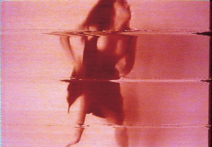
Pipilotti Rist: Eyeball Massage (Video Response) ft Michael Kors A/W 2014 collection at New York Fashion Week


      Over the weekend, I spent a lot of time on creating this response video to artist, Pipilotti Rist who recently did an exhibition at the Hayward Gallery. I thought the exhibition was very creative and attached in the sense that all the pieces followed the same sort of trend effect, however there were other pieces which really stood out to me. The exhibition as a whole was brightly colourful and bold and everything was practically hard to miss, there were various installations which were very appealing and inspirational, thus why I created this video and now I have a reason to do a direct response to this project. The majority of Rist's work was produced in the 1990's and it is very similar to the effects which Mac Photobooth has, hence that could be another experimentation I could carry out using a different media. 

     Despite this, the video I created was supposed to resemble Rist in my own way and due to the theme involving mono, I decided to use the colour blue due to the video I used. The video is a youtube video from a channel called, 'Fashion Channel'. It features the current A/W 2014 Michael Kors collection from New York Fashion Week, hence fashion week inspired me to use a designer which I felt related to our project. I really like Michael Kors collection this season due to it also having a slight mono colouration in his garments. Plus, the structure of some of his garments work very nicely and with how they hang on the body is extremely flattering on some of the models. Vogue.com quote,
          "In his eyes—and in his clothes—we do all lead those beautiful lives. He brings the fantasy of fashion into reality, in part, by distilling some of its most outrageous ideas into something that offers just enough newness to make you feel participant in the larger message without making you struggle with the sometimes challenging proportions, colours, or details."

    Furthermore, I have added effects to the original video and cropped scenes to make the video easier to watch and make it easier for viewers to see how I tried to relate it to Pipilotti Rist's own work. Below are some examples of the works I saw at the Gallery. Unfortunately, these aren't my own pictures as I wasn't allowed to take pictures within the exhibition…